
Visualizing expenses to help people take control over their finances.
Designing a monthly budgeting calculator that helps readers of The Balance better understand their personal finances.
Context
The Balance hosts thousands of daily readers who aim to educate themselves and improve their personal finances. While the website has extensive editorial and illustrative content surrounding budgeting, there currently is no interactive way for users to understand their own expenses.
Team
Product Manager
Designer
Developer(2)
Role
UX/UI Designer
Timeframe
4 Weeks
Platform
Responsive Web
Objective
Design a user-friendly monthly budgeting calculator that helps readers of The Balance better understand how they are managing their money, and where they could improve.
Step 1
Researching the Market
To kick things off, I ran a competitive analysis to see how other companies were approaching the layout and functionality of a budgeting calculator.
Trends
Expense Categorization
Pie chart visualization
Remaining income after expenses
Areas for Improvement
No categorical breakdowns for expenses
Long lists of expenses that are difficult to read or short list that lack context and explanation
Lack of actionability


Step 2
Designing a Solution
To kick things off, I ran a competitive analysis to see how other companies were approaching the layout and functionality of a budgeting calculator.
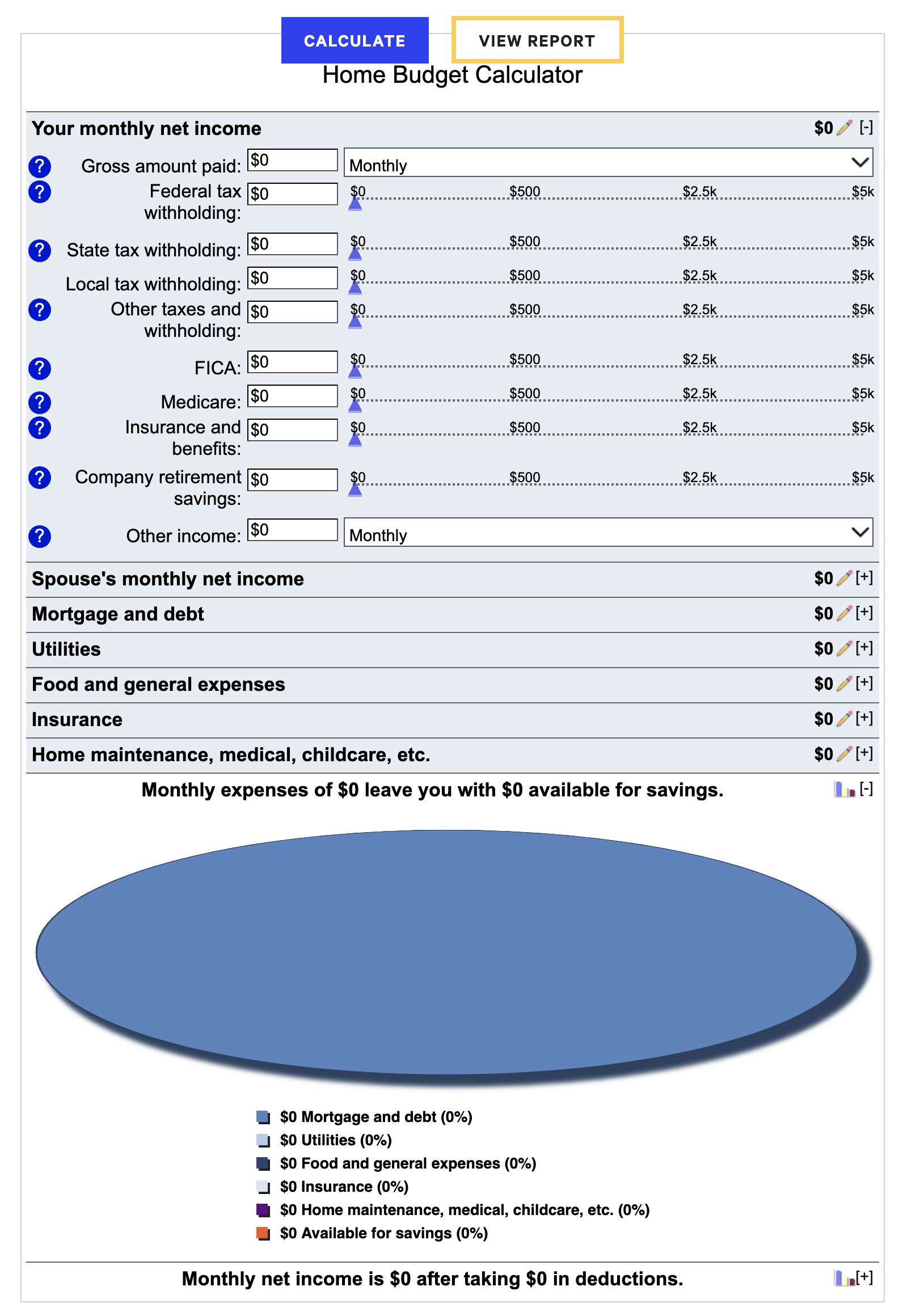
Organizing Expenses to Maximize Space
As I worked with the editorial team to determine all of the necessary expense types and categories, we saw the number of inputs quickly grow into a very lengthy list.
My solution was to categorize all of the expenses and color code expandable drawers. This reduced scrolling and helped users establish a visual connection between the expenses and pie chart.

Easy to Understand Data Visualization
The data visualization was to communicate to the user exactly how their expenses are spread out, and possibly become aware of areas they were spending much more than they realize.
Automatically updating pie chart, to reduce ussr tapping/clicking.
Category percentage breakdown, so users have an additional cue to compare their expenses.
A balance at the bottom indicating what the remainder is.
Lastly, I chose to layout the numbers in the way you might see on a receipt. I felt the familiar pattern made it easy to understand where the totals were coming from.

Actionable Results
A final piece to hammer home the state of the users budget was a status message that updated based on their remaining monthly fund. If the users remaining money, after inputing their expenses, was positive they would receive a message of encouragement to keep up their budgeting habits. If it was negative then they would


Step 3
Testing with End Users
After collaborating with our engineers, we were able to release the budgeting calculator live on The Balance. Following its release I ran a series of user tests to determine whether my design decisions encouraged a positive experience with little to no friction. In these test I asked participants to interact with the calculator as if they were using it for themselves, and then answer a series of questions to gauge their experience.
Test Results
Layout was Seamless & Intuitive
The use of bright contrasting color was well received and enabled the users to have a better understanding of specifically where their take-home pay is being spent.
Tooltips were not seen
Some users questioned what some of the categories meant, and were not aware of/ did not see the tooltip icons for the categories in question.
“I felt that it was very intuitive. I love the colors, and that they tell me exactly how much I’m spending.”
Lacking an Important Expense
Multiple users mentioned the expense of property taxes (which was not included in the calculator), while they were inputing their other home expenses.
“I thought that it was extremely easy to use, and at no point did I feel confused or that i didn’t know what to do.”
Step 4
Incorporating User Feedback
Based on the feedback from the test participants I made some minor updates to the final designs.
1. Add a property taxes input
Many participants mentioned Property tax as a major expense to consider.

2. Make tool tip icons more visible.
Multiple users missed out on using tooltips while interacting with the calculator. They had specifically asked for a feature that was identical to the tool tips, but they were unable to notice them.
Step 5
Hand of to Dev
After completing the final designs and recieving stakeholder approval, I handed off the Figma file to our developers. Collaborating with them during the developments process and conducting design reviews before user stories were marked complete.


